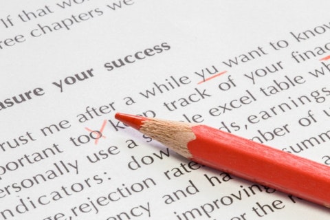
If you plan on publishing a book, especially self-publishing, you might want to read our list of 8 best fonts for reading books.
Writers have it hard, and this is only one of the reasons. Oftentimes, a book’s font can make or break it for a reader. They might not realize that the problem can be narrowed down to such a simple problem, but the wrong choice of font for a book can not only make it difficult to read but messy and downright ugly. The proper font must be simple enough not to be a distraction, spaced out enough to allow easy reading, and serious enough to keep the interest of the reader. It helps if it’s aesthetically pleasing, as well.
There are also fonts that can look beautiful on a desktop or even in print, but awful on a smartphone. Watch out for this, especially if you’re looking to publish an e-book, and find out the best fonts for reading eBook. It won’t be successful if it can’t be read on a smartphone. As for the best font for Kindle publishing, check out some of the eBook Reader’s suggestions, while on LifeHacker you can read about best font size for eBook.

Billion Photos/Shutterstock.com
That doesn’t even cover font size for books, and whether different fonts should be used for headers and titles. That’s a lot of requirements, and sometimes font options can be endless. We’ve all spent way more time than necessary choosing the perfect typeface in Word for certain occasions, and what if it’s a matter of preference? Is there even one typeface that pleases everyone?
Believe it or not, there are a few, and we sought out to find them for you. We consulted articles like Fictionetal‘s 10 Book Typefaces that Can’t Go Wrong, AWAI Online‘s The Best Font’s To Use in Print, Online and in an Email, ThoughtCo‘s Best Font’s For Books, Creativ Indie‘s 8 Brilliant Fonts You Need to Use in Your Book Layout, Holly Brady‘s Best Fonts For Your Self-Published Book, Book Promotion Hub‘s Best Fonts To Use For Your Book, The Book Designer‘s Picking Fonts for your Self-Published Book, In Design Skills‘ Fonts For Books, and National Posts‘s What Fonts Do Writers Use.
Each time a specific font appeared on one of the lists above, we gave it one point and formed our points system from there. All of the sources are credible, and many who wrote the articles above are writers themselves, so they know their stuff. Also, along with each list item below, we’ve provided a link to a Google image of that exact font. Because of course, we knew it would be easier if you could picture the individual fonts.
If you’re interested in more reading about the best fonts, check out our list of easiest fonts to read on screen and paper.
So the bottom line is, yes, we all have our preferences, but there are some fonts that are just easier to read for the general public. And writers and publishers have already figured out exactly which fonts those are. There are 8 of them below in our list of 8 best fonts for reading books, which includes some fonts that most books are printed in. We are starting off with the last two fonts which share the 7th place. Hope you enjoy, and best wishes on publishing your book!
7. Arial
4 points
This is a rather basic font, and it received four points. It’s no doubt you’ve seen Arial around.

Copyright: nexusplexus / 123RF Stock Photo
7. Courier
4 point
If you’re a fan of the vintage typewriter look, you’ll love Courier.

Copyright: ake1150 / 123RF Stock Photo
4. Caslon
5 points
Old style serif typeface is how one website describes this font, which was developed in 1722 (not shown in the picture below).

BeeBright/Shutterstock.com
4. Minion
5 points
You’ll laugh at the link provided for this form of typeface, number five on our list of 8 best fonts for reading books.

Pixabay/Public Domain
4. Sabon
5 points
The fonts number 4 on our list of best fonts for books, start to look the same after looking at them for awhile. But truthfully, there are enough small distinctions to make them vastly different.

India Picture/Shutterstock.com
2. Baskerville
6 points
Where do the names for these fonts come from? Most of them, like this one, come from their designer’s last name.

Copyright: dolgachov / 123RF Stock Photo
2. Georgia
6 points
This font number two on our list of best fonts for reading books is ideal for smartphone reading, so if you’re publishing an e-book, this is the way to go.

Radiokafka/Shutterstock.com
1. Garamond
10 points
This was by far the big winner of our list of 8 best fonts for reading books! Hope you enjoyed reading, and hopefully, this font isn’t too unbearable.

Copyright: sifotography / 123RF Stock Photo


